Secondary text on a sign should be well designed

lhf-logo

Letterhead Fonts is a nice source of information as well as a supplier of awesomely sign-friendly fonts, many designed by real hand letterers. Choosing letter styles for sign work requires special considerations that are not always necessary in other media.


The following link is to a tutorial about how good design principles should be applied to even small, unimportant copy. It’s brief, but well done.

Designing secondary text

………………..

This link is just for fun:

What sign makers want to say sometimes

Think twice before stacking letters vertically

02h62732Vertically stacked letters, a common treatment a century ago, is not a preferred layout technique for sign work.

Though sometimes requested by clients, stacking letters vertically is not only awkward-looking but it compromises legibility. As explained by typographer Ellen Lupton in Thinking With Type, “Roman letters are designed to sit side by side, not on top of one another.” If it is necessary to stack letters, they should be all capitals. Lower case letters treated this way take on a precarious look that is visually unappealing. It also helps to carefully adjust the centering optically of each letter.

A simpler and more readable solution for a narrow vertical format is to rotate the entire line of text. A vertical axis is thus achieved, but the natural relationship of the letters sitting on a common baseline is preserved.

Does this mean that letters should never be stacked? No. In fact, sometimes this treatment is an easy way to achieve a retro look. But it should be used judiciously and with an awareness that it can limit readability.


stacked-letters-comparison02

…………………….


Ellen Lupton is a designer and educator, and the author of several books on design.    Thinking With Type by Ellen Lupton (second edition)

Why white looks bigger than black —the Irradiation Illusion

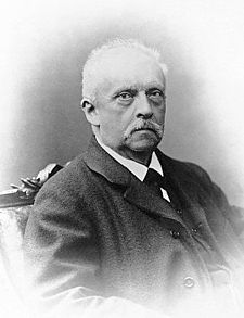
The term irradiation illusion  was coined by German scientist Hermann von Helmholtz in the 1860s to describe the visual perception in which a light area appears larger than an identically-sized dark area. The effect was observed as early as the time of Galileo, who refers to it in his observations of the sizes of planets when viewed through a telescope at different times of day. The illusion is illustrated below. The white square in the black field on the right seems larger than the black square in the white field on the left. It’s as if the white area on the right spills outward beyond its edges into the surrounding black. At the same time, the white field on the left appears to encroach upon the black square making it shrink.

006

The drawing below shows how the irradiation illusion can affect lettering. The top halves of the letters shown are clearly bolder looking than the bottom halves. This means that, on a dark background, a white letter with a heavy stroke will look even heavier, sometimes to the point that legibility is compromised. Counter spaces that are already small become even smaller. Interletter spacing shrinks. Heavy white lettering on a dark background can take on an unpleasant bloated look, and the effect is more pronounced as the viewing distance increases. The solution, simply, is to use lighter stroked letters and increase the letter spacing when the background is dark.

004

This phenomenon of white letters appearing heavier is not always a bad thing. The effect can be put to use at times. It can even save an otherwise weak layout. How so?

Put the Irradiation Illusion to good use

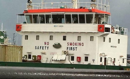
Computer font collections tend to have a disproportionately high number of light faced letter styles. These typestyles are designed mostly for print, not for signs. Times Roman, as an example, is an inherently weak letter style on sign work. It looks fine in print, up close. After all, it was designed for newspapers held at arm’s length, paper whose porous qualities actually help thin-faced letters. Paper, especially newsprint, allows inked letters to bleed a little through capillary action (the printer’s term for this is dot gain). This effect allows the hairline strokes characteristic of many romans to achieve a little more thickness when printed. But in large sizes on signs, the thin strokes of painted or vinyl lettering remain thin lines. Add to this thinness the effect of the irradiation illusion, and the strokes become even thinner. The result is that a large sign lettered in all Times Roman has a distinctly anemic look. In printspeak, the lettering is not ‘black’ enough. It appears insubstantial, weak. The thinnest strokes eventually disappear as viewing distance increases, leaving visible only a series of meaningless vertical strokes. But if you create a reversed color scheme—putting white roman letters on a black background—the letters instantly become a little stronger.

Similarly, the legibility of some scripts can be improved by a dark background. Computer scripts are often so light faced as to be useless for sign work without some kind of ‘stroking’ to beef them up. Using a dark background can sometimes solve the problem with minimal effort.

Before computer fonts

In the days of painted signs, the expanding/shrinking illusion of irradiation was a problem easily addressed. For one thing, sign painters did not use fonts [related post:  Sign painters didn’t use fonts], so they were not burdened with picking through hundreds of unusable typestyles to find the few that worked well. Their letter styles, “alphabets,” as they called them, were all hand drawn specifically for sign work. Generally, these styles were not duplicates of typestyles that were created for print. And letterers tended to rely on medium and medium-heavy stroke weights for the bulk of their work. When a light typestyle was required, say, by an insistent client, or when an architect specified a certain typeface, it was easy to thicken the strokes slightly if needed for legibility. This could even be done on the fly during the brush lettering process. When a sign painter used script, it was most often a medium weight, sometimes heavy, infrequently light. Experienced sign painters knew that light faced lettering often produced weak-looking signs that lacked impact.

Good design is rarely accidental

In sign design, legibility is dependent on the interplay of light and dark images. Letter recognition relies not only on the positive image of the letterform but also on the negative space surrounding and within it. When one or the other is overpowering, there is always a compromise of legibility. This is why medium weight letters tend to be the most legible on sign work. It doesn’t mean heavy or light faced letters should not be used at all. Rather, it means using them prudently.

Being aware of, and carefully manipulating, effects like the irradiation illusion can help a sign artist produce good layout. Effective design is not an accident.

………………..

My inspiration for this article is an archived blog by UK designer and typographer Jon Tangerine from 2010:    jontangerine.com

………………..

Hermann von Helmholtz

hermann-von-helmholtz

Hermann von Helmholtz bio in brief.    from famousscientists.org

Hermann von Helmholtz bio   from Encyclopedia Britannica. His pursuits as a scientist were broad. Perhaps best known for his invention of the ophthalmoscope in 1861, still an essential diagnostic tool used in medicine today.

Hermann von Helmholtz   from the Stanford Encyclopedia of Philosophy. Details of his interests, philosophies, teachings and accomplishments.

225px-hermann_von_helmholtz


Organize your layouts using Proximity

The design principle of proximity organizes layouts so that they can be read easier and quicker. What is proximity? It is the moving of design elements closer together or further apart. The goal is to create groupings.

Grouping design elements by proximity makes the message easier to comprehend, because it helps the viewer connect related elements without effort. It makes thought groups clear, where one piece of information ends and another begins.

poor-design-decisions-481__605
This photo from the site boredpanda.com illustrates how poor use of proximity can muddy the intended meaning of a sign. Perhaps the designer thought the message would be clear by using colors to connect the related words in the two lines of copy. The humorous result shows that proximity trumps color.


A mistake that many novice designers make is to fill up a sign with the largest possible lettering and graphics. The result is that there is no clear separation between crowded thought groups and the composition becomes a chore to decipher.

Part of the problem is that an inexperienced designer fears white space, believing that by reducing it the letters can be made larger and “easier to read.” This is self-defeating because the resulting layout has a busy, crowded look that appears disorganized and is actually more difficult to read. Such a layout can look like too much work to a viewer. It is easily ignored.  —for a comprehensive discussion of the importance of not making a viewer work to comprehend a message, see Don’t Make Me Think Revisited by Steve Krug (2014). While his discussion centers on web page usability, it applies with equal force to sign layout.

The importance of proximity, creating groupings, is especially important when copy is heavy.

When a client insists on a sign with heavy copy it puts a great burden on readability. Heavy copy, in itself, is a strike against a layout. It should be taken for granted that a significant number of viewers will ignore the sign because of heavy copy alone. But we can still make it readable, inviting, by using proximity, aggressively corralling copy into copy blocks surrounded by generous margins. We can create the visual impression that the layout is less busy than it really is.

Aggressively corral copy into copy blocks surrounded by generous margins. The proximity principle means grouping related elements to enhance readability.
Aggressively corral copy into copy blocks surrounded by generous margins. The proximity principle means grouping related elements to enhance readability, as shown on the right.

A menu sign is an excellent example of a sign that usually has heavy copy, but that can be tamed by using margins and clear separations of menu items. Clarity on a menu is absolutely critical. The proximity principle can make it happen.

menu
A menu is typically heavy copy, yet clarity and organization are essential. The above menu, designed by Kevin Dyke, Kevin Dyke Designz, illustrates excellent use of the proximity principle. Generous margins and ‘gutters’ divide all the design elements. Secondary copy is corralled into tight copy blocks under each menu item. Food groupings are further collected together into gray boxes with generous margins between them. The grouping of all the elements has been aggressive enough to even have space “left over” for inviting photos, yet the overall effect is inviting, comfortable, without being crowded.


All upper case slows reading time

ABC

“Reading in word units is the most important characteristic of the mature reader,” says David Jury in his book, About Face: Reviving the Rules of Typography.

A beginning reader reads in a linear way, word by word. A mature reader reads in word groups in a series of quick back and forth movements across a line of text. Between these jumps, called saccades, our eyes stop for a fraction of a second. These stops, or fixations, may occur many times a second. The more proficient a reader is, the longer are the jumps and the fewer the stops.

In eye-movement tests, upper case letters require far more fixation points than do lower case letters, adding to the time required to read.  Experiments by Tinker and Patterson in 1928 found that reading all caps was 11.8% slower than reading lower case. A later study, which measured longer reading periods, found all upper case to be 19% slower for reading periods of five and ten minutes, and 13.9% slower for reading periods of twenty minutes. Presumably, as the reading period lengthened, the readers grew more accustomed to reading all caps, which may suggest one reason that reading upper and lower case mixed is easier and quicker to read—we are used to it.
On the other hand, some studies indicate that the distinctive word shapes produced by the ascenders and descenders in lower case lettering also play a part in quick word recognition.

Upper and mixed case contrast02

It’s interesting that if we cover the top half of a line of lower case lettering, it is almost impossible to read. But if we cover the bottom half, it is still possible to read the text, suggesting that the upper parts of the letters and the ascenders are especially important in word recognition.

Half covered letters02


Regardless of the reason for it, reading text in all caps can increase the time necessary to read a message, whether it’s on a book page or on a sign.

Upper case takes up 40-50% more area. This reduces the number of words perceived within each eye fixation, which may explain the increased number of fixations required for all caps.  Line spacing needs to be increased slightly with all upper case for it to be legible. The result is that signs in all upper case tend to look more filled, busier, more crowded, than the same amount of copy in mixed case.

In sign work, it is important for a viewer to read messages easily and quickly. Anything we as designers can do to speed up and facilitate the process is going to be of benefit.


Sign design hierarchy is like a chain of thought

It’s helpful to compare the hierarchy necessary in good sign design to a chain of thought.

A chain of thought is the logical sequence of the parts of an argument. It is a succession of “points” on a path of reasoning. That’s why we call it a line of reasoning—because there should be a logical order to the parts.

Good sign design is also a sequence of information. It should be presented to viewers like the beads on a string. They should be able to easily view the information in a logical order. They should be able, without thinking, to read first what we want them to read first, to read second what we want them to read second, and so on. We must create a visual hierarchy, in descending importance.

A good sign design’s plan always includes the order in which the parts are to be viewed. If we do not control this sequencing of visual information, the composition will likely be easily ignored, just like an illogical, incoherent argument is ignored.Beads

Why computer fonts can be a problem

Historically, sign painters leaned heavily on letter styles that were relatively bold. They didn’t use fonts, the name for collections of type. They didn’t even use the word “font.” “Font” was a printer’s term, not part of the sign painter’s vocabulary. Letter styles used by letterers were called alphabets. When a thick-and-thin letter style, commonly called a roman, was used on sign work, it was usually a version that was visually substantial. That is, thin strokes were thicker and serifs were not too delicate. Similarly, when lettering with script, thin strokes were not made too skinny.

Computer fonts, by contrast, can create legibility problems on signs, due to the fact that light faced letter styles predominate in sign software. Even the bold versions of many roman fonts have thin strokes that are not practical for general sign work.

Consider Times Roman, designed specifically for the London Times newspaper. It is very legible—in print. On a sign, however, more often than not, it looks weak and hinders readability. It has thin strokes that are simply too thin for distance viewing at larger sizes. Even in the bold version, the thin strokes are not substantial enough to be practical for general sign work. A sign lettered in all Times Roman has a distinct anemic look. There is too much space; it is too “white.” Times Roman, and it’s sibling Times New Roman, was made for newspaper reading. It was not designed to be used in large sizes and at the distances required for sign viewing. The main problem is that the thin strokes are so thin that they tend to disappear from view as the reading distance increases, leaving only the bold strokes visible.

The fact that so many computer fonts are designed for print, not for signs, is responsible, at least in part, for the flood of poor and ineffective sign work being created today. The majority of letter styles produced with computer software are simply unsuitable for sign work.

In the days of painted signs, a sign painter could ensure that roman letters were readable by thickening the thin strokes as needed on the fly. Widening a letter stroke was as simple as applying extra pressure to a lettering brush, mashing out the hairs so that a wider line was painted. Using a larger lettering brush was also an option. Sign painters were not tied to fonts that couldn’t be modified. Modifications were easy. Type styles were usually not reproduced exactly, but that wasn’t the goal. Rather, an alphabet was adjusted as needed for legibility and readability.

It is evident that part of the solution to making signs more effective today is to make more use of heavy and medium stroked letter styles, and using light faced letters sparingly. Times Roman is really not an excellent choice for sign work, even in its so-called bold version. It’s sometimes possible to artificially improve the legibility of Times Roman by “stroking” it, that is, adding a contour or outline to the letter, in the same color as the letter, to thicken the strokes. This distorts the outline of the letter, of course, but at least the thin strokes don’t disappear as readily. It’s best to do this stroking procedure on the light or medium versions of the letter rather than the bolder versions.

Sometimes a dark background can save a letter with skinny strokes. Strokes tend to appear a little heavier when light letters are put on a dark background. Landscape painters say that light colors “advance,” or grow in perceived size, while dark colors “recede,” or shrink. Especially is this true on internally-illuminated signs. The legibility of a thin-stroked letter is almost always improved by a lighted sign that has a dark background.

My preference is to simply avoid using Times Roman on most sign work, choosing instead a naturally bolder letter. I especially like fonts that have been created by sign painters. Knowing the limitations and weaknesses of letter styles designed for print, these font designers have produced letter styles that work well in large sizes and at greater distances.

So, choose fonts for signage carefully. Make choices that circumvent the problems created by letter styles that were designed for print thus avoiding the anemic look that is so common in computer-generated sign design today.

Legibility versus Readability

Legibility and readability are not the same.

A sign is legible when it is not impossible to read. That is, letters are recognizable, words are spelled correctly, the message makes sense. But is legibility enough for sign work to be effective? No. To say that a sign is legible is like saying that shoe leather is edible. But are you going to eat it?

Effective sign design is more than legible. It must be readable. It must do more than inform. It should entice and please. It must invite, welcome, convince. While legibility asks, “Am I able to read this?” readability asks, “Do I want to read this?”

So, what makes for readability in sign work? In reality there are many things that can contribute to readability. There are proven design principles, best practices, even a few rules, that work most of the time, though nothing works perfectly all the time. For example, good letter style choices, good prioritization of copy, good contrast, generous amounts of white space and appealing graphics are among many factors that can transform a sign design from merely legible to highly readable.  Much of what makes sign work readable is simplicity and clarity balanced with eye appeal. A mix of beauty and utility. And just as a song may be performed differently by different musicians, there may be many approaches to how we deliver a visual message as well.

In my opinion, anyone can learn effective sign design. It’s like learning a language, though perhaps not as effortlessly. It takes focus and doesn’t happen overnight. In the introduction to his book, “Graphics for Business,” John McWade observes that “The hard work it takes to make good design is almost universally underestimated. Even to designers, design looks easier than it is. To many people, design looks easy enough for a child to do. Reality, however, is very different.”

Yet it’s not as difficult as learning a second language, which may take years of intense persistence. It’s easier than that. Still, historically, good sign layout has been an elusive skill for sign makers. And now that practically anyone can be in the sign business by purchasing computer equipment and software, mediocre and ineffective sign work is flooding the market.

One of the most important steps in producing effective sign design is the realization that it is not the result of spontaneous wizardry. It is learned. Sign design is a form of communication, like speaking a language or learning to read—and anyone can do it. It is problem-solving visually, using principles that work, principles that can be learned. Good sign design is not to be confused with fancy or elaborate sign design. It’s not about outlines and shades and highlights. But it’s more than legibility.

Effective sign work is readable.