In the United States, a typeface, that is, the design of a letter style, the way the letters appear, is not protected by copyright. Hence, a letter style may be designed to look like an exact duplicate of another without infringement. However, a font, that is, the unique underlying software code that allows you to print a particular typeface, is protected. This has long been the position taken by both the US Congress and the US Copyright Office.
The group Georgia Lawyers for the Arts in an online article posted February 10, 2014, explains it this way:
“A typeface is a set of letters, numbers, and punctuation marks whose forms are related by repeating certain design elements that are consistently applied. Put more simply, typeface refers to the way a set of letters or numbers appears… A font, on the other hand, is the computer program that tells the printer or computer display how a letter or character is supposed to be shown. In the United States, fonts are protectable under copyright law. Typefaces, however, are not.”
Similar typefaces may be similar in appearance. Two typefaces may even appear identical. But if they are each based on their own unique digital code, there is no copyright infringement in the US. A copyright infringement occurs when someone, without permission of the original author, copies a font file, which is actually a small software program. A font file is protected as an original work.
Interestingly, the name of a typestyle may be protected as a trademark.
No. Because ownership of a trademark is not absolute. Just as the fair use defense exists in US copyright law, there are times when the use of a trademark without permission from the owner does not constitute infringement.
The purpose of a trademark is to identify the source of goods or services. It is to prevent consumer confusion in the marketplace. However, as noted by New York attorney Brian Farkas at the website, NOLO, “the use of a trademark does not necessarily qualify as an infringement if the user is not using the trademark as a mark.” (italics added)
He states that “if you use the mark for informational or editorial purposes to identify specific products and services, or if your use is part of an accurate comparative product statement,” it could be fair use. He also gives some good examples of such fair use.
Further, use of a trademark in parody can be considered fair use. A photographer’s use of the Barbie mark was acknowledged as fair use by the Ninth Circuit Court of Appeals (2003).
Many believe that good logo design is only a judgment call. That there are no rules. Yet it seems reasonable that there are basic principles that, generally, should be followed for a design to be effective.
Jason Li, a co-founder of TomYum, a design firm based in Toronto, made some insightful comments on this subject. See if you agree.
How long does it take to receive a trademark registration once you apply for one to the US Patent & Trademark Office? According to trademark attorney Erik M. Pelton, “Each application is unique. No one can guarantee the outcome or the timing.” However, as he explains on his website, “the vast majority take somewhere around a year to reach registration or a final disposition.”
The process can be affected by many factors. For example, how skilled is the attorney handling the process? As with many professionals, expertise can vary from person to person. A seasoned trademark lawyer should be able to produce a well-crafted trademark application that would minimize the chances of triggering what is known as an “Office Action” from the USPTO. An Office Action signals an obstacle in the approval process or the application. An experienced attorney will not only be able to reduce the odds of an Office Action occurring but will know what to do when one does.
An example of an obstacle in the approval process may be a “descriptiveness finding.” The USPTO may refuse a trademark application if the trademark is deemed “merely descriptive.” A good trademark attorney can help avoid this finding at the very beginning by giving advice on the client’s choice for a mark. If a descriptiveness finding does occur, the attorney can then give advice on the options available for a response to the finding—along with, possibly, an estimate on how much additional time and cost could be added to the process.
Another obstacle that can seriously delay the registration process, and add greatly to its cost, is a third party challenge to a trademark application. Just how long a delay is possible is illustrated by the case of the Washington Redskins football team. A trademark application for the name was filed in 1992, but due to a series of legal challenges and appeals, the application did not receive approval till January of this year, more than 25 years later. Granted, this was an exceptionally long period of time for a final disposition to be reached, and ultimately it took a US Supreme Court decision last year that paved the way for the legal challenge to the Redskins’ trademark registration to be ended, but it illustrates how long the process can be when serious obstacles arise.
There are various types of trademarks. Some are more difficult to protect than others. Adescriptive trademark is inherently weak, at least at first, because it may sound generic. The Weather Channel is an example of a descriptive trademark. Cartoon Network is another. Descriptive names may eventually gain strength and be protectable as trademarks, but it may take time and aggressive marketing. This type of mark must acquire a strong “secondary meaning” beyond its generic meaning for it to be effective as a trademark. A trademark attorney will know this and may even advise against a descriptive mark.
Another type of trademark is called arbitrary. It may have no apparent connection to the product or service it represents. Examples: Exxon, Kodak, Apple. Arbitrary names can gain great strength and be quite protectable. And while it may be relatively easy to obtain a registration for an arbitrary trademark, it may take time for it to become familiar enough to the public to be immediately associated with the product or service.
A type of trademark that falls between arbitrary and descriptive is calledsuggestive. Suggestive trademarks are somewhat descriptive because they are revealing, but usually in a creative way. Here are some good examples: Youtube, Groupon, Netflix. Some trademark attorneys feel that a suggestive trademark is best, especially for smaller businesses that do not have the time or money to spend on a large marketing effort.
In the final analysis, though an attorney can help avoid pitfalls in a trademark registration process, thus increasing the odds for an approval, as well as saving time, no one can predict with certainty how long the registration process will eventually take. Or even if it will be approved.
Letterhead Fonts is a nice source of information as well as a supplier of awesomely sign-friendly fonts, many designed by real hand letterers. Choosing letter styles for sign work requires special considerations that are not always necessary in other media.
The following link is to a tutorial about how good design principles should be applied to even small, unimportant copy. It’s brief, but well done.
The US Patent and Trademark Office, as of January 14, has changed a number of fees in connection with trademark registration.
Notable is the jump in the fee for filing a paper application for trademark registration. The per-class fee for filing an initial application is now a whopping $600, an increase of $225 over the previous $375. The fee for filing an online application has increased from $325 to $400, a bump of $75.
It has always been more costly to file a paper application as opposed to an electronic one, but now the difference is $200 rather than a mere $50. Why the big difference? According to the USPTO’s website, it is part of “incentivising.” Electronic filing is more efficient and it costs less. Filing online is therefore preferred and encouraged.
Other fees increased
A number of other fees have increased as well. Filing a Statement of Use has doubled in cost, from $100 to $200, and a Request for an Extension of Time for Filing a Statement of Use has gone up $75. There is even an apparently new charge called an Additional Fee forExpedited Service, a “rush” charge. It’s $160.
In addition to providing incentive to file electronically, the increases are also part of an effort to “better align fees with full costs,” according to the government website.
It should be noted that these price increases are in connection with federal trademark registrations only and do not affect trademark registrations at the state level. Most states in the US offer trademark registrations at a much lower cost than what the USPTO charges, though the protection is more limited. In addition, trademark rights also derive from simply using a trademark in connection with goods or services. These are called common law trademark rights, and are limited to the geographical area where the mark is used. To prove common law rights in a trademark, it must be shown that the one claiming ownership of the mark was the first to use the mark in a geographical area.
For example, a website about logo design makes this comment:
When successful, a logo will tell the story of the brand without requiring any words. It will tell a compelling story about your brand, consistently. It’s how your customers will remember you, and it’s the way you will stand out in a crowded marketplace. It’s how the most beloved brands are born.
Is this really true? I would agree that a successful logo can eventually tell a compelling story without words. But is it how most beloved brands are born? Hardly.
A newborn logo usually tells nothing
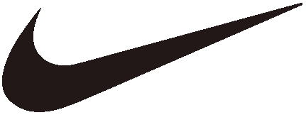
There is no doubt that the beloved Nike swoosh tells a story that is both compelling and persuasive. It tells a story, not just of sports apparel, but of athletic endeavor in general. In addition, it has tremendous eye appeal in its simplicity, and it is quite memorable.
But did the Nike logo tell this story when it was born? No. It didn’t tell anything at all. In fact, when it was first presented to Nike executives, they did not really care for it that much. They were hoping for something along the lines of Adidas’s three stripes. But they went with the swoosh anyway and it has become wildly successful in the Nike branding scheme. It conveys a story of athletic achievement, even excellence.
But, again, it wasn’t born that way. And so it is with the logos of most “beloved brands.” Look at the following logo images and ask yourself: If you did not already have an accumulation of experiences and associations in connection with them, what would they mean to you? In other words, if you saw them for the first time, what story would they tell?
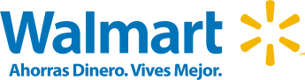
On seeing these logos for the first time, they would tell you nothing. They might even mislead you a little. What does Target’s “target” say? The first impression might be a message about archery or firearms rather than “upscale discount store.” Looking at these logos now, and being familiar with the companies behind them, they are filled with meaning. Even the yellow star has quickly become recognizable as part of Walmart’s new look. Though the Walmart logo does not reveal much on its own, it seems to be part of a strategy to improve the image of the discount retailer. Notice the subtle difference in the tag line. The old logo’s tag line was “Low Prices Every Day. Always.” The new tag line is “Save Money. Live Better.” It’s an obvious effort to avoid the impression of peddling only price. Whether the changes have actually improved Walmart’s “discount” image or not, the revised design of the logotype has quickly become a familiar new look. It is no longer a dated-looking hyphenated name, and the capital M is gone. It is a nicely improved design (in my opinion). And, by the way, do you know the difference between the two Target logos? Did you know they are two different companies and have no connection to each other. One is US and the other Australian. Trademark infringement is not an issue because they don’t compete in the same countries. I know what the Target store sells in the US because I shop there. I don’t have a clue what Target sells in Australia. Why? Because the logo doesn’t tell me.
The Apple computer logo
The Apple computer logo has gone through a few permutations in its history. The rainbow version, Apple’s second logo design, was used from 1977–1998 and does not tell a story, at least not inherently. It has no implicit connection to computers at all. The first logo did. It was designed in pen and ink by an early Apple partner who left the company. But that first logo was quickly seen as unsuitable. Current Apple logos preserve the shape of the apple in the 1977 version, but without the stripes. Actually, the shape has been refined a little down through the years. There is now a starkly simple black version of the apple and some chrome-looking versions.
Urban legends have arisen around the supposed symbolism connected to the Apple logo. One of them is that the stripes are a reference to the flag of the gay community—because Alan Turing, the inventor of the first real computer, was gay. Further, Turing reportedly committed suicide with a cyanide-laced apple. But according to the Apple logo’s designer, Rob Janoff, the various stories about its symbolism are all bogus. He said the logo didn’t have any symbolic meaning, other than the fact that it was a play on the company name. In fact, Janoff wasn’t even given a design brief, other than a request by Steve Jobs to not make it too “cute.” In an interview with Janoff, when asked what other designers should look out for when designing logos, he said, “The main thing is to make it simple, because designers especially young designers tend to over-design or clients want too many things in there. I think people who tried to work a logo too hard, having too much meaning, wind up with something that’s too complex.”
Janoff actually designed two versions of the apple. One with the bite and one without, in case Jobs thought the bite was too cute.
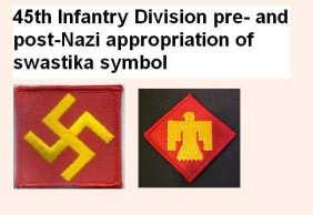
The swastika
The swastika tells a story, too, and not a happy one. But it was not born that way. In more than one of the world’s religions, this symbol has been beloved for centuries, and as recently as the years between the two world wars it was the proud emblem of the 45th Infantry Division of the United States Army. This army division was originally a US National Guard unit based in Oklahoma, and the crooked cross, a Native American symbol, was chosen as an acknowledgment of the state’s heritage. Does this surprise you? The swastika is a logo whose story has changed radically.
This Boeing P-12, a fighter plane used by the US Army between the two world wars, bears the insignia of the 45th Infantry Division.
When we look at a well-known logo, we see more than just a stylized word or a graphic image. We see a world of associations and experiences that have accumulated over the life of the organization or product it represents. But a logo design is not born with these associations. They are the result of time and, likely, aggressive marketing. A newborn logo is very much like a book with blank pages. It does not tell a story. And it does not necessarily need to.
Does this mean that a logo should not tell a story? No. It’s true that there are numerous logos that do reveal something of a business or the product or service of a business, and there are many designers who have cleverly created marks that are simple yet contain visual clues that are revealing to some extent. But as to the question of whether a logo needs to do this to be successful, the answer is, no it does not need to.
What are some characteristics of a good logo? It should be memorable. It helps if it is attractive. Simplicity is good, but not an absolute requirement.
But a logo does not need to tell a story, at least not when it’s first designed. It’s like an empty pot waiting for meaning that will be poured into it by experience and the passing of time. Only then will it tell a story.
………………………………………..
This US Army captain in the 158th Field Artillery Regiment wears the shoulder patch of the 45th Infantry Division before the design was changed from the swastika to the thunderbird.
………………………………………….
An interesting read is the book, The Swastika: Symbol Beyond Redemption? by Steven Heller. Heller is author, editor and co-editor of more than one hundred books on design and popular culture.
A logo is often one of a company’s most valuable assets. A logo mark may represent the company, its image and reputation, or the reputation of its products or services. Many logos are protected by trademark registration. Many more benefit from trademark protection without registration. Because a mark may be such a valuable asset, many companies have branding guidelines in place to carefully control the use of company logos.
It’s a given that a company’s logo should appear prominently in its signage. But what should a sign maker do if a sign buyer orders sign work featuring logos that it does not own? Should sign companies act as trademark police and require proof of permission before they put a logo on a sign? Most do not. They simply produce the work in good faith, assuming that the sign customer is not infringing by displaying the logo, though many sign shops, when asked to place a national logo on sign work, make an effort to obtain branding guidelines from the sign buyer or the national chain.
Occasionally, a retailer will say, “We didn’t ask permission to use their logo, but we sell their product so it will be okay to use it.” The retailer reasons that he or she is giving their supplier free advertising—and who would object to that? In reality, the use of a protected logo without permission constitutes infringement. And rather than viewing the display of its logo as free advertising, the company owning the mark may be more concerned about how its good name and reputation might be affected by unauthorized use. Why so?
Here is a purely hypothetical example. A siding company believes it would be a selling point to put the Alcoa logo on their signs since they use Alcoa aluminum products. So they order signs with the Alcoa logo on them. Alcoa later contacts the siding company and tells them they are not allowed to display the logo on their signs and to remove it. They explain to the contractor that, while they appreciate his loyal business, his use of the logo without permission is trademark infringement.
Why might Alcoa not view this as desirable free advertising in this fictitious scenario?
Trademark law protects a reputation by preventing confusion
Trademark protection is designed to prevent confusion among consumers. Alcoa may have no desire to be in the siding installation business, but the sign with Alcoa’s logo could give consumers the wrong impression that it is in the business,
And what if the siding company does shoddy work? The improper use of the logo on the sign could conceivably tarnish Alcoa’s reputation or the reputation of its products. It may have taken many years of aggressive marketing for Alcoa to develop a respected name in the aluminum products industry, and protecting this good image may be a high priority for the company. So trademark protection can serve to help protect the good name of a brand. Further, if a siding company has a customer that is unhappy enough, the customer may decide to start a lawsuit, even naming Alcoa in the suit, since the Alcoa logo appears on the siding company sign.
Consequently, Alcoa avoids this whole bundle of problems by simply not allowing their logo to be used on siding contractor signs. Alcoa may feel that the small amount of advertising the sign gives them is not worth the potential problems. So it may prohibit the use of its logo in a siding contractor’s advertising. Of course, this story is hypothetical and may not represent Alcoa’s actual policies, but it may illustrate why a large company would be selective about how its trademarks are used.
It’s true that many people, including a well-intentioned siding contractor, may view this as a case of a large corporation using a ‘big stick’ unnecessarily. But that’s because most people don’t realize the potential danger to a trademark of allowing even small infringements to go unchecked. Trademark protection, for it to stay in force, requires watchful management. Trademark protection for a mark may live or die depending on how vigilant the trademark holder is in defending it. The government has put the responsibility for policing infractions squarely on the shoulders of the trademark owner. There are no ‘trademark police’ provided by the US Patent & Trademark Office (USPTO), or any other government agency.
Trademark attorney Erik Pelton, in a recent blog, gives this advice:
Deal with any potential infringements quickly. The more investments of time and money someone puts into using a name [illegally], the more attached to it they become and the more complicated getting them to stop is likely to be.
Vertically stacked letters, a common treatment a century ago, is not a preferred layout technique for sign work.
Though sometimes requested by clients, stacking letters vertically is not only awkward-looking but it compromises legibility. As explained by typographer Ellen Lupton in Thinking With Type, “Roman letters are designed to sit side by side, not on top of one another.” If it is necessary to stack letters, they should be all capitals. Lower case letters treated this way take on a precarious look that is visually unappealing. It also helps to carefully adjust the centering optically of each letter.
A simpler and more readable solution for a narrow vertical format is to rotate the entire line of text. A vertical axis is thus achieved, but the natural relationship of the letters sitting on a common baseline is preserved.
Does this mean that letters should never be stacked? No. In fact, sometimes this treatment is an easy way to achieve a retro look. But it should be used judiciously and with an awareness that it can limit readability.
There were two different business owners, with two different philosophies on promising deadlines.
The Promiser
The first one, the Promiser, tried to accommodate everyone’s needs. If someone needed a job done the next day, he rarely said no. If someone requested a job be done in three days, he said okay. If they needed it in two weeks, he told them, “No problem.” If instead, a customer simply asked when a job would be done, he gave them a completion date based on how quickly he thought he could get it finished. Some customers didn’t ask for completion dates. They just approved the job and said, “call me when it’s done.”
But problems arose for the Promiser when things didn’t always go as planned; if due to unforeseen factors, a job took longer than anticipated. Sometimes a supplier was late with a delivery, or a mistake was made in production requiring a re-do of part of the job. Or an employee became sick. So a deadline that at first seemed within reach was missed. In an attempt to placate an irritated customer, an unplanned free delivery was made, adding yet more time to the job. But the problems did not end there. The late job bumped other jobs that were in line waiting to be done, annoying more customers. If one of them was angry enough, that job was moved to the front of the queue and marked “hot.” And what about the customers that just said to call them when the job was ready? Their jobs were repeatedly delayed. Deadlines were missed frequently, and because jobs were often rushed in an effort to catch up, more mistakes were made. Jobs came back almost weekly for correcting or remaking. Occasionally, jobs were even sent out with known mistakes just to avoid missing the promised deadline. (The business owner reasoned that he was gaining breathing room to get other things done before the customer noticed the mistake and returned). In his mind, the owner felt he was doing his best, even bending over backward for his customers. Still, he developed a reputation for not respecting deadlines. A reputation that he could never quite overcome.
How was this person able to survive in business? He had two things going for him. First, he was one of the cheapest in town. He regularly asked customers how much his competitors were quoting and he tried to undercut them much of the time. He developed a reputation for low prices that kept customers coming back who otherwise would have gone elsewhere out of frustration. Some customers, wise to his overpromising, called frequently after ordering to check on the progress of their jobs. They learned from their past experience with him that he serviced the ‘squeakiest wheels’ ahead of others. So, they squeaked.
The second factor in his favor was the tremendous size of the market in his area, providing a constant influx of new customers attracted by his prices. He lost many customers due to missed deadlines, but they were constantly replaced by new ones.
The overpromising by this business owner created additional problems beyond missed deadlines. Employee moral ran low. When some workers discovered that the owner often blamed his missed deadlines on his workforce, they became frustrated and resentful. Employee turnover was significant. In an effort to reduce mistakes and expedite jobs, the owner habitually micromanaged workers, constantly looking over their shoulders, making decisions for them on even minor matters of production. He constantly asked for progress reports, looking for ways to hurry jobs along. In an effort to save time, and because he “didn’t want to spend all day writing,” the owner frequently produced job orders lacking crucial information, preferring instead to give extended verbal instructions that were not always perfectly remembered. This resulted in more mistakes and more missed deadlines. The owner was not a bad person but, under the pressure, he often became rude and critical and was rarely patient with employees. Moral sank even lower.
The Hardnose
The Hardnose was not a bad person, either. Actually, she was a smart businessperson. She tried to accommodate clients’ deadlines just as the Promiser, but with one major difference in procedure. She always—always—generously padded her time estimates. If she thought the job required five days, she never told the customer five days. She told them seven or eight, or more, and she didn’t budge. If she knew she could do a job in two weeks without a problem, she told the customer three weeks, even if they said they needed it completed as soon as possible. She was hard-nosed about giving herself wiggle room. She assumed, correctly, that something would go wrong on a job as often as not. If on the other hand, the job was completed ahead of schedule, as it often was, she sometimes, but not always, called a client to report that the job was finished early. She developed a reputation for never being late. The result was that she was in demand and she was able to charge a higher rate than the Promiser. Yet she worked no harder than he did.
It seems that the Promiser was in constant fear that a competitor would give his customers a better turnaround time. So he rarely said no to a request. His efforts were all focused on landing the job, after which he concentrated on getting it done in time. The Hardnose was motivated by fear, too, but not fear of losing a job. She feared for her reputation, and she was willing to turn down work to protect it. In the end, customers trusted her. Her word was golden. The cushion of time that she gave herself when scheduling produced an additional cushion, one of goodwill with her customers. In a recent blog, marketing expert and author Seth Godin made the observation that this cushion of goodwill is like a form of “overdraft protection” for your business. The cushion can save your reputation when you occasionally fall short on a promise, which inevitably happens.
The Hardnose invested in overdraft protection, both in scheduling and in customer trust. The Promiser did not. He took too many chances. And his “insufficient trust fees” hurt him.


 Vertically stacked letters, a common treatment a century ago, is not a preferred layout technique for sign work.

