Many, including designers, believe so.
For example, a website about logo design makes this comment:
When successful, a logo will tell the story of the brand without requiring any words. It will tell a compelling story about your brand, consistently. It’s how your customers will remember you, and it’s the way you will stand out in a crowded marketplace. It’s how the most beloved brands are born.
Is this really true? I would agree that a successful logo can eventually tell a compelling story without words. But is it how most beloved brands are born? Hardly.
A newborn logo usually tells nothing
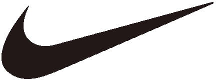
There is no doubt that the beloved Nike swoosh tells a story that is both compelling and persuasive. It tells a story, not just of sports apparel, but of athletic endeavor in general. In addition, it has tremendous eye appeal in its simplicity, and it is quite memorable.
But did the Nike logo tell this story when it was born? No. It didn’t tell anything a![]() t all. In fact, when it was first presented to Nike executives, they did not really care for it that much. They were hoping for something along the lines of Adidas’s three stripes. But they went with the swoosh anyway and it has become wildly successful in the Nike branding scheme. It conveys a story of athletic achievement, even excellence.
t all. In fact, when it was first presented to Nike executives, they did not really care for it that much. They were hoping for something along the lines of Adidas’s three stripes. But they went with the swoosh anyway and it has become wildly successful in the Nike branding scheme. It conveys a story of athletic achievement, even excellence.
But, again, it wasn’t born that way. And so it is with the logos of most “beloved brands.” Look at the following logo images and ask yourself: If you did not already have an accumulation of experiences and associations in connection with them, what would they mean to you? In other words, if you saw them for the first time, what story would they tell?
![]()


On seeing these logos for the first time, they would tell you nothing. They might even mislead you a little. What does Target’s “target” say? The first impression might be a message about archery or firearms rather than “upscale discount store.” Looking at these logos now, and being familiar with the companies behind them, they are filled with meaning. Even the yellow star has quickly become recognizable as part of Walmart’s new look. Though the Walmart logo does not reveal much on its own, it seems to be part of a strategy to improve the image of the discount retailer. Notice the subtle difference in the tag line. The old logo’s tag line was “Low Prices Every Day. Always.” The new tag line is “Save Money. Live Better.” It’s an obvious effort to avoid the impression of peddling only price. Whether the changes have actually improved Walmart’s “discount” image or not, the revised design of the logotype has quickly become a familiar new look. It is no longer a dated-looking hyphenated name, and the capital M is gone. It is a nicely improved design (in my opinion). And, by the way, do you know the difference between the two Target logos? Did you know they are two different companies and have no connection to each other. One is US and the other Australian. Trademark infringement is not an issue because they don’t compete in the same countries. I know what the Target store sells in the US because I shop there. I don’t have a clue what Target sells in Australia. Why? Because the logo doesn’t tell me.
The Apple computer logo
The Apple computer logo has gone through a few permutations in its history. The rainbow version, Apple’s second logo design, was used from 1977–1998 and does not tell a story, at least not inherently. It has no implicit connection to computers at all. The first logo did. It was designed in pen and ink by an early Apple partner who left the company. But that first logo was quickly seen as unsuitable. Current Apple logos preserve the shape of the apple in the 1977 version, but without the stripes. Actually, the shape has been refined a little down through the years. There is now a starkly simple black version of the apple and some chrome-looking versions.
![]()

Urban legends have arisen around the supposed symbolism connected to the Apple logo. One of them is that the stripes are a reference to the flag of the gay community—because Alan Turing, the inventor of the first real computer, was gay. Further, Turing reportedly committed suicide with a cyanide-laced apple. But according to the Apple logo’s designer, Rob Janoff, the various stories about its symbolism are all bogus. He said the logo didn’t have any symbolic meaning, other than the fact that it was a play on the company name. In fact, Janoff wasn’t even given a design brief, other than a request by Steve Jobs to not make it too “cute.” In an interview with Janoff, when asked what other designers should look out for when designing logos, he said, “The main thing is to make it simple, because designers especially young designers tend to over-design or clients want too many things in there. I think people who tried to work a logo too hard, having too much meaning, wind up with something that’s too complex.”
Janoff actually designed two versions of the apple. One with the bite and one without, in case Jobs thought the bite was too cute.
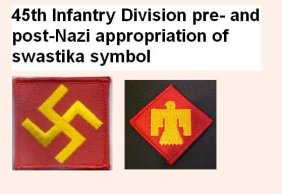
The swastika

The swastika tells a story, too, and not a happy one. But it was not born that way. In more than one of the world’s religions, this symbol has been beloved for centuries, and as recently as the years between the two world wars it was the proud emblem of the 45th Infantry Division of the United States Army. This army division was originally a US National Guard unit based in Oklahoma, and the crooked cross, a Native American symbol, was chosen as an acknowledgment of the state’s heritage. Does this surprise you? The swastika is a logo whose story has changed radically.

When we look at a well-known logo, we see more than just a stylized word or a graphic image. We see a world of associations and experiences that have accumulated over the life of the organization or product it represents. But a logo design is not born with these associations. They are the result of time and, likely, aggressive marketing. A newborn logo is very much like a book with blank pages. It does not tell a story. And it does not necessarily need to.
Does this mean that a logo should not tell a story? No. It’s true that there are numerous logos that do reveal something of a business or the product or service of a business, and there are many designers who have cleverly created marks that are simple yet contain visual clues that are revealing to some extent. But as to the question of whether a logo needs to do this to be successful, the answer is, no it does not need to.
What are some characteristics of a good logo? It should be memorable. It helps if it is attractive. Simplicity is good, but not an absolute requirement.
But a logo does not need to tell a story, at least not when it’s first designed. It’s like an empty pot waiting for meaning that will be poured into it by experience and the passing of time. Only then will it tell a story.
………………………………………..

………………………………………….
An interesting read is the book, The Swastika: Symbol Beyond Redemption? by Steven Heller. Heller is author, editor and co-editor of more than one hundred books on design and popular culture.
The Swastika: Symbol Beyond Redemption? Steven Heller (2008)

Great Post
LikeLike
Definitely a logo should represent the services you are providing.
LikeLike